Graphically Tracking Tumor Markers
The graph below can be used to show an individual's tumor marker decrease curve while on chemotherapy. By right-clicking on the graph and then selecting the appropriate web-browser function, the image can be printed, or saved for later printing.
Points plotted on the graph are normalized with respect to the initial tumor marker level. If the first measured level was, say, 1512, then the normalized value to be plotted would be 1512 / 1512 = 1.00. If the following measured level is, for example, 704, the normalized value would be 704 / 1512 = 0.46. The short horizontal lines at the bottom of the page can be used to calculate the normalized values.
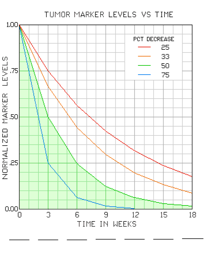
The graph shows four reference curves. Each corresponds to a given percentage of tumor marker level decreases between adjacent pairs of readings. For CA-125, according to some sources, a 50 percent decrease, or better, for the first two periods is highly desirable. If your decrease rate is less than 50 percent for that timeframe, your oncologist will likely be thinking of other protocols somewhere down the road.
As an electrical engineer, I can't be offering any "medical advice" on this topic, but nevertheless, if your early CA-125 decrease rates are less than 50 percent, it might be helpful to be adding BHT to your diet. (See the parent article for details.) This should, of course, be done with your health provider "in the loop."
Click Here to see a filled-in graph.
For further info contact Robert Fritzius
Top